
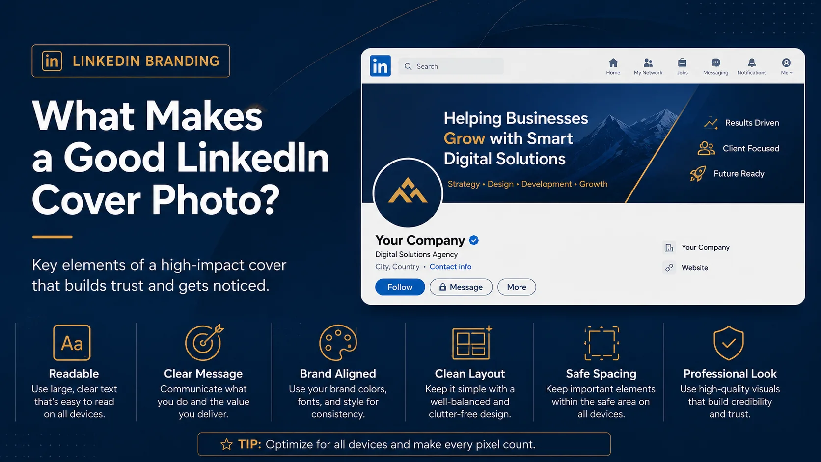
A good LinkedIn cover photo does more than fill empty space at the top of your profile. It helps visitors understand who you are, what you do, and why they should take you seriously. Your profile photo, headline, About section, and experience still matter, but your cover image is one of the first visual elements people notice when they land on your profile.
Many people treat the LinkedIn cover photo like a background decoration. They use a random city image, a blurred office photo, a stock pattern, or the default LinkedIn banner. The issue is not that these images are always bad. The issue is that they often do not say anything useful about the person or brand behind the profile.
A strong LinkedIn cover photo should support your professional message. It should look clean, be easy to read, match your brand, and guide visitors toward the right impression. Whether you are a consultant, founder, coach, designer, job seeker, executive, freelancer, agency owner, or business service provider, your banner can help your profile look more complete and credible.
Why Your LinkedIn Cover Photo Matters
LinkedIn is a professional platform, and first impressions happen quickly. When someone opens your profile, they immediately see your profile photo, headline area, and cover image. If the cover photo is blank, blurry, or unrelated, the profile may feel unfinished. If the cover photo is clear and professionally designed, it can make the profile feel more intentional.
A good LinkedIn cover photo can help you communicate your value before a visitor scrolls down. It can show your niche, service, industry, company, personal brand, or call to action. It can also support trust by making your profile look more polished.
This does not mean the cover image should be overloaded with information. In fact, the best LinkedIn banners are usually simple. They use one clear idea, strong spacing, and readable text.
Start With One Clear Message
The most important part of a good LinkedIn cover photo is clarity. Before choosing colors, graphics, or fonts, decide what the banner should communicate.
Ask yourself one simple question: what should people understand after seeing my cover photo for three seconds?
Your answer might be:
- You help small businesses with digital marketing.
- You are a leadership coach for executives.
- You design websites for service-based businesses.
- Your company provides software for operations teams.
- You are open to work in a specific field.
- You are a speaker, consultant, or founder.
Once you know the message, keep the text short. A long paragraph will not work well inside a LinkedIn banner. People view profiles on different screen sizes, so the text needs to be quick to read and easy to understand.
Use Readable Text
Text readability is one of the biggest differences between a professional cover photo and an amateur one. A banner may look beautiful at full size, but if the text becomes too small on mobile, it will not do its job.
Use large text for your main message. Avoid thin fonts, low contrast colors, and long sentences. If your background is dark, use white or light-colored text. If your background is light, use dark text. The goal is to make the message visible without forcing the visitor to zoom in.
A good structure is to use one main headline and one short supporting line. For example:
- Helping Coaches Build Premium Personal Brands
- Digital Marketing Strategy for Local Service Businesses
- Leadership Coaching for Growing Teams
- Custom LinkedIn Cover Photos for Professionals
These are clear, short, and easy to understand. You do not need to explain everything inside the banner. The cover photo should create interest and support the rest of your profile.
Keep Important Content Away From Risky Areas
A LinkedIn cover photo does not display exactly the same on every device. Desktop, tablet, and mobile views may crop or adjust the image. Your profile photo also overlaps part of the banner. This means important text, logos, and calls to action should not be placed too close to the edges or behind the profile image area.
For best results, keep the most important content toward the center and upper-middle area. Avoid placing key details in the far corners. Give the design enough empty space so it still looks balanced if LinkedIn adjusts the display.
This is one reason custom LinkedIn cover photo design is helpful. A designer can create a profile-safe layout where your message is visible and your banner still looks good across different screens.
Match Your Brand Colors
Your LinkedIn cover photo should feel connected to your personal brand, company website, logo, and other marketing materials. If your website uses navy and gold, your LinkedIn banner should not suddenly use bright pink and green unless there is a clear brand reason for it.
Brand consistency helps people remember you. It also makes your profile look more trustworthy. When your LinkedIn profile, website, proposal, and social media visuals all share a similar style, your brand feels more established.
For personal profiles, brand colors can be simple. You may use two or three colors that match your industry and personality. For company pages, the banner should usually follow official brand guidelines.
Use a Clean Visual Hierarchy
Visual hierarchy means the design guides the viewer’s eye in the right order. In a LinkedIn cover photo, the main headline should be noticed first. Supporting details, icons, or website links should come second.
If every element is the same size, color, and weight, the design becomes confusing. A good banner uses contrast, spacing, and font size to show what matters most.
For example, a strong layout may include:
- A bold headline on the left or center
- A short supporting line underneath
- A small logo or website URL
- Simple background graphics or imagery
This structure keeps the design organized and easy to scan.
Choose Images That Support Your Message
Some LinkedIn cover photos use photographs. Others use abstract graphics, gradients, icons, patterns, or branded shapes. There is no single best style for everyone. The right choice depends on your goal.
A city skyline may work well for real estate, finance, consulting, or local business branding. A nature background may work for coaching, wellness, sustainability, or personal development. A technology-inspired design may suit SaaS companies, developers, IT consultants, cybersecurity brands, or digital agencies.
The key is relevance. Do not choose an image only because it looks nice. Choose a visual that supports the story you want your profile to tell.
Avoid Too Much Clutter
A common mistake is trying to add everything into one banner. Some people include multiple services, phone numbers, email addresses, social icons, long taglines, badges, logos, and detailed graphics. This usually makes the design harder to understand.
Your LinkedIn cover photo should not work like a full website page. It should work like a clean visual introduction. One message is better than five weak messages.
If you offer multiple services, group them in a simple way. For example, instead of listing every detail, you might use three short words such as “Strategy · Branding · Growth.”
Include a Simple Call to Action When Useful
Not every LinkedIn banner needs a call to action, but it can be useful for service providers and businesses. A short CTA can guide visitors toward the next step.
Examples include:
- Book a consultation
- Visit our website
- Let’s connect
- Now hiring
- Download the guide
Keep the CTA short. It should support the main message without dominating the design.
Make It Look Professional, Not Overdesigned
A professional LinkedIn cover photo does not need heavy effects, too many icons, or complicated visuals. In many cases, simple is better. Clean typography, proper spacing, strong contrast, and brand consistency are more important than flashy design.
The goal is to look credible. Your banner should make visitors feel that you take your work seriously. It should not distract from your profile or make the page look noisy.
Final Thoughts
A good LinkedIn cover photo is clear, readable, branded, and professionally arranged. It communicates one main message, keeps important elements in safe areas, uses strong visual hierarchy, and supports your personal or company brand.
If your current LinkedIn banner is blank, outdated, blurry, or unrelated to your work, updating it can make your profile look more complete. A strong cover photo will not replace a good headline, About section, or experience history, but it can improve the first impression and make your profile feel more trustworthy.
The best LinkedIn cover photo is not the busiest one. It is the one that helps people understand you faster.