
A professional LinkedIn Page needs more than a logo and a few company details. The images you upload also play a major role in how people see your brand. Your Page logo, cover image, Life tab visuals, company photos, and shared post images all help create a first impression before a visitor reads your About section, services, jobs, or updates.
The problem is that many businesses upload images without checking LinkedIn’s recommended dimensions first. As a result, the cover image may look stretched, the logo may appear blurry, or important text may get cropped on mobile screens. This can make an otherwise strong company page look unfinished.
In this guide, we will explain the recommended image specifications for LinkedIn Pages and Career Pages, why the dimensions matter, how to prepare your visuals before uploading, and what design mistakes to avoid.
Why LinkedIn Image Specifications Matter
LinkedIn is a professional platform, so your company visuals need to look sharp, clean, and credible. Whether someone visits your Page from a search result, job post, employee profile, sponsored post, or shared update, your branding should look consistent.
Using the correct LinkedIn image sizes helps you avoid blurry or pixelated images, prevent important text from being cropped, keep your logo clear on different backgrounds, and make your company page look more professional. It also helps create a better visual experience for visitors, candidates, and potential clients on desktop and mobile.
A LinkedIn Page cover image is especially important because it is one of the largest visual areas on your company page. It can show your brand message, service focus, hiring campaign, company culture, or product positioning. But if the image is not designed in the right size, your message may not appear the way you planned.
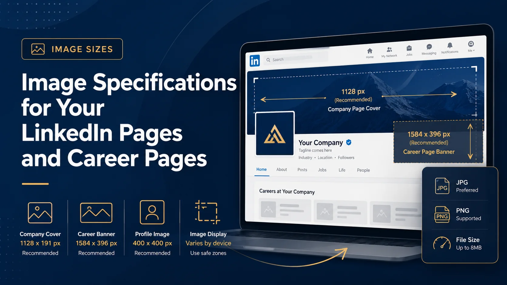
LinkedIn Page and Career Page Image Size Table
Below is a helpful table based on LinkedIn’s recommended image specifications for Pages and Career Pages.
| LinkedIn Image Type | Minimum Image Size | Recommended Image Size |
|---|---|---|
| Page Logo Image | 268 x 268 pixels | 400 x 400 pixels |
| Page Cover Image | 4200 x 700 pixels | 4200 x 700 pixels |
| Life Main Image | 1128 x 376 pixels | 1128 x 376 pixels |
| Life Custom Modules | 502 x 282 pixels | 502 x 282 pixels |
| Life Company Photos | 264 x 176 pixels | 900 x 600 pixels |
LinkedIn also states that Page and Career Page images must be PNG or JPEG files and should not exceed 3MB in file size.
Best Image Format for LinkedIn Pages
LinkedIn accepts PNG and JPEG files for Page and Career Page images. Both formats can work, but the best choice depends on the type of visual you are uploading.
JPEG is usually a good option for photographs, team images, office photos, culture images, and realistic visual backgrounds. JPEG files can keep photo quality high while keeping file size lower.
PNG is often better for graphics that include logos, icons, text, sharp edges, or flat color areas. If your LinkedIn cover image includes your company logo, a headline, design elements, and brand colors, PNG may help keep those details crisp.
However, file size still matters. If the image is too heavy, it may not upload properly. If it is too compressed, it may look blurry. The goal is to keep the image clear while staying within LinkedIn’s file size limit.
LinkedIn Page Logo Image
Your LinkedIn Page logo appears in several places, including your company Page, posts, search results, employee experience sections, and sometimes in recommendations. That means it needs to be easy to recognize even at small sizes.
LinkedIn recommends a 400 x 400 pixel logo image. A square logo usually works best because LinkedIn displays logos in a compact square or circular area depending on placement.
When preparing your logo, use a clean version of your logo, avoid tiny taglines inside the image, keep enough padding around the logo mark, test the logo on light and dark backgrounds, and avoid uploading a low-resolution screenshot of your logo.
If your logo has a transparent background, check how it appears after upload. Some transparent logos may not look right when shown on different background colors. A version with a solid or carefully prepared background can sometimes be more reliable.
LinkedIn Page Cover Image
The LinkedIn Page cover image is the wide banner at the top of your company Page. LinkedIn recommends 4200 x 700 pixels for the Page cover image.
This is a very wide format, so the layout needs to be planned carefully. A common mistake is placing text too close to the edges or filling the entire banner with small details. LinkedIn may adjust the cover image to fit different screens, which means some parts of the image can be cropped horizontally or vertically.
A strong LinkedIn Page cover image should include a clear brand message, simple and readable text, your brand colors, professional background visuals, enough empty space, and important content placed near the center. For example, a company page cover could include a short headline such as “Helping Small Businesses Build Better Online Brands” or “Reliable IT Support for Growing Companies.”
Safe Area Tips for LinkedIn Cover Images
Even when you use the correct dimensions, you should still design with safe spacing in mind. LinkedIn pages are viewed on laptops, large desktop monitors, tablets, and mobile phones. The cover image can display differently depending on screen size.
- Keep important text away from the far left and right edges.
- Avoid placing key information in the lower-right corner.
- Do not place important details too close to the top or bottom.
- Keep your main message closer to the center area.
- Use fewer words and larger text.
- Preview the image after uploading.
The goal is not just to upload the right size. The goal is to make sure your design still looks good after LinkedIn adjusts it for different devices.
LinkedIn Career Page Images
Career Pages allow companies to showcase employer branding, workplace culture, employee stories, hiring messages, and company values. If your company uses LinkedIn Career Pages, the Life tab images become important because they help candidates understand what it is like to work with your company.
LinkedIn recommends 1128 x 376 pixels for the Life Main image, 502 x 282 pixels for Life Custom modules, and 900 x 600 pixels for Life Company photos. These images should feel authentic and professional. You can use team photos, office photos, culture highlights, behind-the-scenes visuals, employee moments, event images, or workplace values.
For Career Pages, avoid using random stock images that do not represent your company. Candidates often want to see real culture, real people, and real workplace energy. If you do use designed graphics, keep them simple and aligned with your brand.
Custom Images for LinkedIn Page Posts
When you add a custom image to a Page post with a URL, LinkedIn recommends using a 1.91:1 ratio, commonly 1200 x 627 pixels. The image should also be more than 200 pixels wide.
This is useful when you share blog posts, service pages, landing pages, case studies, or announcements from your company Page. If the image is too small, it may show as a small thumbnail instead of a larger feed image.
For post images, focus on one main idea. A good LinkedIn post image should not be overloaded with text. Use a clear headline, strong contrast, and simple visual structure. If you are sharing a blog post, the image should support the topic and encourage people to click.
Common LinkedIn Image Mistakes to Avoid
Many LinkedIn Pages look less professional because of small design mistakes. Here are some common issues to avoid.
Uploading blurry images
Blurry images make your brand look less polished. Always use high-resolution visuals and avoid stretching small images.
Adding too much text
Small text can become unreadable, especially on mobile. Keep your message short and direct.
Ignoring mobile display
A cover image may look good on desktop but lose important details on mobile. Keep your main message in a safer central area.
Using inconsistent branding
If your logo, cover image, post graphics, and website all use different styles, your brand may feel disconnected. Use consistent colors, fonts, and visual direction.
Placing important content near the edges
LinkedIn may crop images depending on screen size. Important words, logos, or calls to action should not sit too close to the edges.
Professional Design Tips for LinkedIn Page Images
If you want your LinkedIn visuals to look more polished, use your brand colors consistently, keep your cover image message short, use large readable typography, keep enough spacing around text, match your LinkedIn design with your website, and export the final image carefully before uploading.
A well-designed LinkedIn cover photo does not need to be complicated. In most cases, a clean layout with one strong message will look better than a crowded design with too many elements.
Final Thoughts
LinkedIn image specifications are important because they help your Page look professional across different devices and screen sizes. The correct dimensions give your visuals a strong technical foundation, but good design is still what makes the biggest difference.
Your LinkedIn Page logo should be clear and recognizable. Your cover image should communicate your brand message quickly. Your Career Page images should support your company culture and hiring goals. Your post images should be sized properly and easy to understand in the feed.
Before uploading any image to LinkedIn, check the recommended size, keep the file under the required limit, use PNG or JPEG, and place important details away from the edges. These small steps can help your LinkedIn Page look more credible, more consistent, and more professional.